DockPanel Suite: Theme Reloaded
A detailed look at DockPanel Suite's theme reloading process, Visual Studio theme integration, and how to create custom themes using the Visual Studio Color Theme Manager.
I blogged about DPS theming a few times, aiming to demonstrate how we ported VS2012 Light theme in, how the related API was refactored, and how themes became separate NuGet packages. But I never expected that today I can blog about two new themes and potentially more from you. So let’s get started.
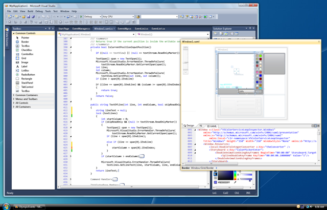
Visual Studio 2010
Interestingly that Microsoft gave up Windows Forms and built Visual Studio 2010 on WPF. That instantly led to a brand new theme being shipped,
 Figure 1: Visual Studio 2010 Blue Theme.
This is a blue theme, which many people easily got bored with.
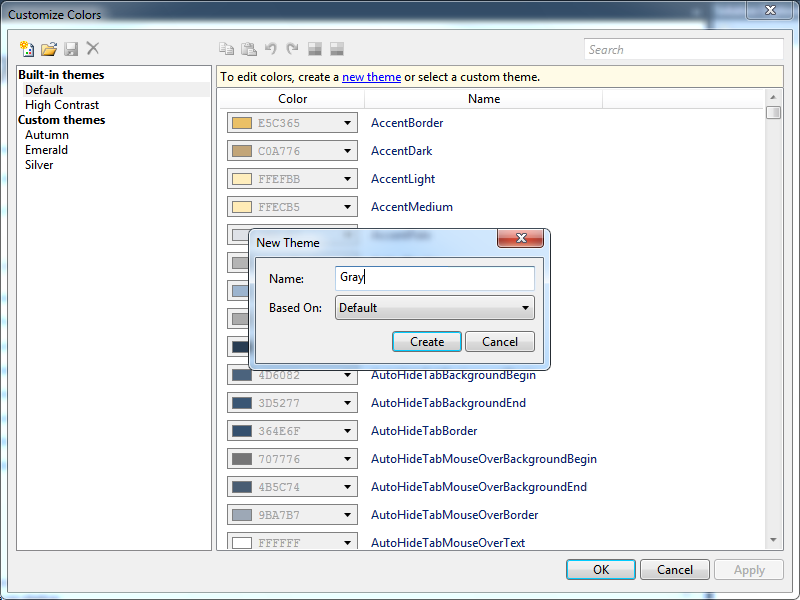
Visual Studio Color Theme Manager
So an extension was soon released by Microsoft for end users to design their own themes.
 Figure 2: Visual Studio Color Theme Manager.
Visual Studio 2012 Themes
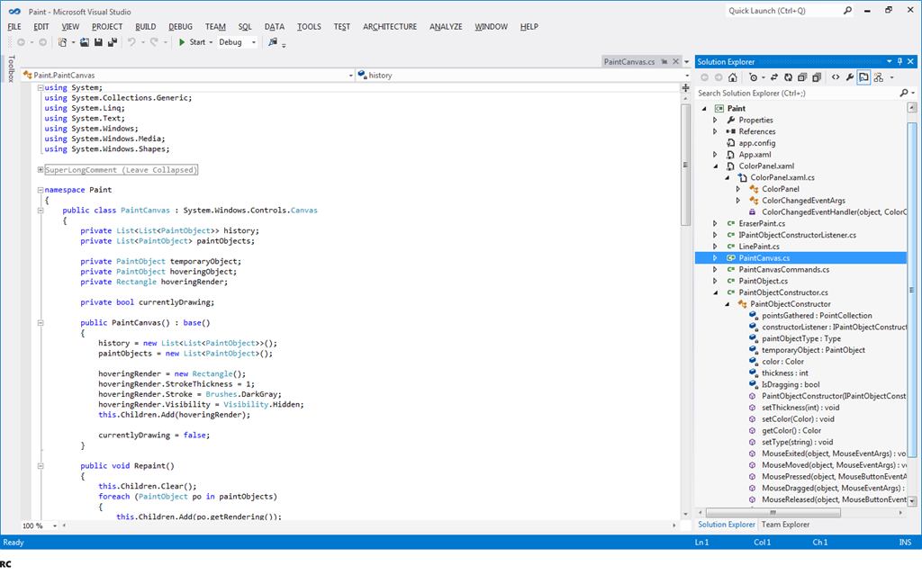
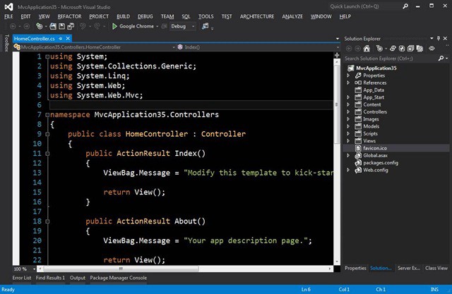
When Microsoft initially designed Visual Studio 2012, they came across the idea to ship by default, a light theme and a dark theme.
 Figure 3: Visual Studio 2012 Light Theme.
 Figure 4: Visual Studio 2012 Dark Theme.
Surprisingly, the blue theme was added back in a later update, due to community feedback. Color Theme Manager is also updated for VS2012.
Later Visual Studio Releases
Visual Studio 2013 and 2015 do ship all three themes by default (Light, Dark, and Blue), and they also have Color Theme Manager extensions.
DockPanel Suite’s Old Themes
If you are familiar with our previous code base (2.10 for example), you know that we use DockPanelSkin to store the colors used in each themes. It was an old design mainly for Visual Studio 2003/2005 themes. So using it to help render Visual Studio 2012 Light and 2013 Blue themes is painful.
New Theme Design
As Color Theme Manager exposes the internals of Visual Studio themes as color palette, it is in fact quite easy to design a few new classes in DPS to map the palette and the colors. So in 2.11 release, I finally have some time to finish it.
DockPanelSkin now has a ColorPalette property, which in turn contains further properties to map to each of the core colors of a theme. So to create a new theme like VS2012DarkTheme, we just need to change the colors to the values provided by Color Theme Manager. Yes, it is just that simple. And now we have a full family of VS2012 themes (Light, Dark, and Blue).
The testing of new themes also revealed a few minor bugs that we neglected in the past. For example, the last tab on tool window strip does not have a separator unless it is active. They are now fixed.
However, one price we have to pay is that VS2013 Blue theme is now broken. I will see if I can fix it before we ship 2.11 final release. But you can of course switch to VS2012 Blue theme which is more mature.
So now if you want to create a new theme, you can follow this guide.
New Alpha Builds
2.11 Alpha 4 is now available for you to test out the new themes.
Stay tuned.